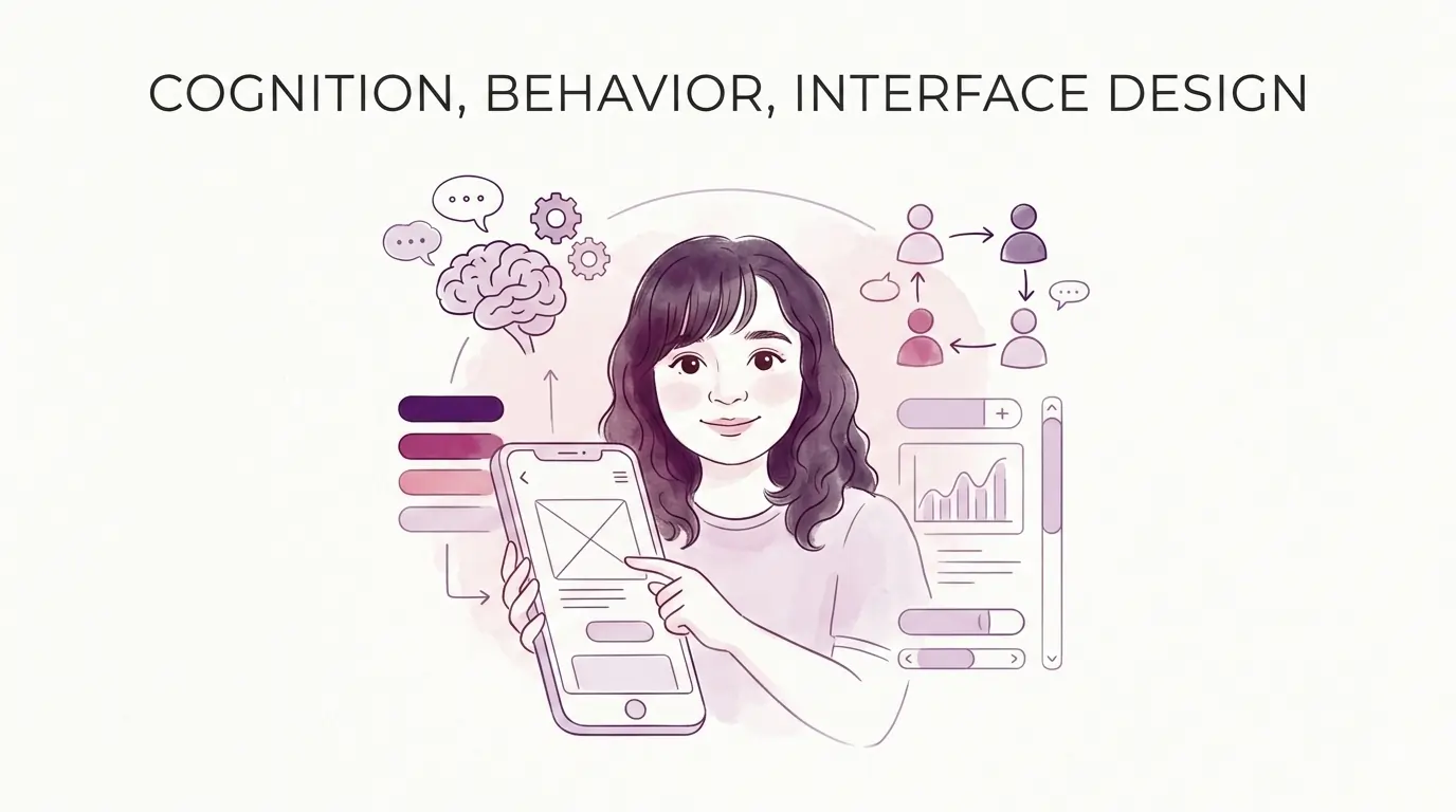
Understanding human psychology is essential for creating interfaces that users love. When we design with cognition and behavior in mind, we create experiences that feel natural, intuitive, and enjoyable. This guide explores key psychological principles every UX designer should know.
Understanding Cognitive Load in UX Design
Cognitive load is the mental effort users need to interact with your interface. Managing cognitive load is crucial for creating user-friendly designs.
Three Types of Cognitive Load
Intrinsic Load: The natural difficulty of the task
- Completing a purchase process
- Learning a new application
- Finding specific information
Extraneous Load: Mental effort from poor design
- Confusing navigation
- Inconsistent terminology
- Cluttered layouts
- Unnecessary animations
Germane Load: Mental effort for learning and understanding
- Building mental models
- Connecting new concepts
- Developing expertise
UX Principles for Reducing Cognitive Load
Progressive Disclosure
Show information gradually rather than all at once. This respects limited working memory.
Practical Example: Multi-step forms instead of one overwhelming form
- Step 1: Essential information only
- Step 2: Optional preferences
- Step 3: Additional details
Information Chunking
Group related items together. Our brains handle 5-7 items best in working memory.
Example: Navigation categories instead of flat lists
- Shop: Products, Categories, Deals
- Account: Profile, Orders, Settings
- Help: FAQ, Contact, Support
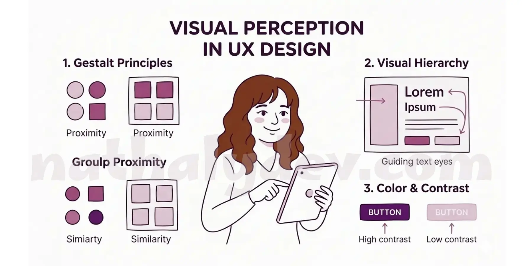
Visual Perception in UX Design
Key Gestalt Principles
Our brains naturally organize visual information. Use these principles to create intuitive interfaces:
Proximity
Group related items together. Users see close elements as connected.
Similarity
Similar elements look related. Use consistent styling for similar actions.
Continuity
Guide eyes naturally through your interface with clear visual flow.
Closure
Our brains complete incomplete shapes. Use this for clean, minimalist designs.
Creating Visual Hierarchy
Users scan interfaces—they don’t read. Help them focus on what matters:
Hierarchy Elements:
- Size: Larger elements get more attention
- Color: Bright colors stand out
- Position: Top-left areas get primary focus
- White Space: Room around important elements
- Typography: Weight and size create emphasis
Decision Making in Interface Design
Hick’s Law: Less Choice, Better UX
More options = slower decisions. Simplify choices for better user experience.
Applications:
- Limit navigation to 5-7 main items
- Use progressive disclosure for complex settings
- Provide smart defaults
- Group related options
Fitts’s Law: Make Targets Easy to Hit
Time to click depends on target size and distance. Critical for mobile design.
Guidelines:
- Important buttons should be larger
- Place frequent actions in easy-to-reach areas
- Minimum 44×44px touch targets
- Consider thumb reach zones
Memory and Learning
Recognition Over Recall
It’s easier to recognize than remember information.
Design for Recognition:
- Use familiar icons and symbols
- Show recent activity
- Display saved information
- Use visual cues
Reduce Memory Demands:
- Don’t make users remember information
- Show context and status
- Use autocomplete and suggestions
- Provide clear navigation
Emotional Design for Better UX
Three Levels of Design
Visceral: First impressions and visual appeal
- Clean aesthetics build trust
- Colors create emotional responses
- Visual design affects perceived usability
Behavioral: Satisfaction from using the interface
- Easy and efficient interactions
- Sense of control and accomplishment
- Pleasant micro-interactions
Reflective: Long-term satisfaction
- Brand connection and meaning
- Personal values alignment
- User loyalty and retention
Color Psychology in UX
Colors influence user emotions and behavior:
- Blue: Trust, security, professional
- Green: Success, growth, nature
- Red: Urgency, errors, importance
- Orange: Energy, creativity
- Purple: Luxury, wisdom
- Black: Sophistication, authority
Accessibility and Inclusive Design
Cognitive Accessibility
Design for different cognitive abilities:
Clear Communication
- Use simple, direct language
- Avoid technical jargon
- Write in active voice
- Use short sentences
Consistent Design
- Maintain navigation patterns
- Use consistent terminology
- Provide clear visual hierarchy
- Keep interactions predictable
Flexible Options
- Adjustable text sizes
- High contrast modes
- Reduced motion settings
- Multiple input methods
Testing Your UX Design
Key Testing Methods
Cognitive Walkthroughs
- Can users understand what to do?
- Can they predict outcomes?
- Do they feel confident?
- Can they recover from errors?
A/B Testing
- Test simplified vs. detailed interfaces
- Compare different layouts
- Test various interaction patterns
- Measure completion rates
User Analytics
- Heat maps show focus areas
- Session recordings reveal struggles
- Conversion funnels identify drop-offs
- Time metrics measure efficiency
Practical UX Guidelines
| Best Practices | Avoid These |
|---|---|
| Use consistent patterns | Overwhelm with information |
| Create clear hierarchy | Use inconsistent terminology |
| Break complex tasks into steps | Hide important functionality |
| Provide immediate feedback | Make users remember information |
| Use familiar icons | Use confusing labels |
| Include helpful error messages | Create unnecessary barriers |
| Design for all skill levels | Ignore accessibility |
| Test with real users | Assume all users think alike |
Real-World UX Success Stories
E-commerce Checkout
- Problem: High cart abandonment
- Solution: Simplified form, progress indicators, clear errors
- Result: 35% less abandonment
Mobile App Navigation
- Problem: Users couldn’t find features
- Solution: Simplified navigation, visual hierarchy, contextual help
- Result: 50% more feature discovery
Dashboard Design
- Problem: Information overload
- Solution: Logical grouping, collapsible panels, clear hierarchy
- Result: 40% faster task completion
Conclusion: Design for Human Psychology
Understanding cognition and behavior is essential for creating interfaces that truly serve users. By applying psychological principles to design decisions, we can create experiences that are not only visually appealing but also cognitively efficient and emotionally engaging.
Key takeaways:
- Respect cognitive limitations
- Design for recognition, not memory
- Create clear visual hierarchy
- Provide immediate feedback
- Test with real users
Remember that good interface design is not about following rules blindly—it’s about understanding human psychology and designing systems that work with our natural cognitive processes, not against them.
The best interfaces work with human cognition, not against it. They respect attention limits while leveraging natural perception patterns. The key is to continuously test, learn, and iterate based on real user behavior and feedback.
Need help applying UX psychology to your project? Book a call for expert UX design services.
For more design insights, explore our guides on web development and component libraries.