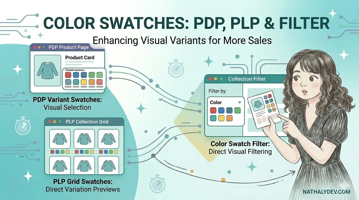
Color swatches are an essential visual element that significantly enhances the Shopify shopping experience by allowing customers to quickly see available color options without clicking through multiple product pages. This comprehensive guide will walk you through implementing color swatches across three key areas: Product Detail Pages (PDP), Product Listing Pages (PLP), and collection filters.
Whether you’re a Shopify theme developer or store owner looking to improve user experience and conversion rates, this step-by-step tutorial will help you add professional color swatches that match your brand’s aesthetic while maintaining fast loading times and mobile responsiveness.
Benefits of Color Swatches
- Enhanced User Experience: Visual color selection reduces clicks and improves conversion rates
- Professional Appearance: Creates a polished, modern look that matches customer expectations
- Better Product Discovery: Helps customers quickly identify preferred color options
- Reduced Bounce Rate: Visual engagement keeps users browsing longer
- Mobile-Friendly: Touch-friendly color selection on all devices
Implementation Overview
This comprehensive guide covers three main implementation areas for Shopify color swatches:
- Product Cards (PLP) - Display color swatches on collection pages, featured collections, and related product sections
- Collection Filters - Implement color-based filtering with visual swatches for better user navigation
- Product Detail Pages (PDP) - Add color swatch variant selectors for intuitive product customization
Prerequisites for Implementation
Before diving into the implementation, ensure you have:
- Access to your Shopify theme’s Liquid files
- Color swatch images prepared as PNG files (detailed requirements below)
- Basic understanding of Shopify theme structure and Liquid templating
- Theme customization permissions in your Shopify admin
File Structure Overview
You’ll be working with these key files:
card_product.liquid- Product card template for collection pagesfacets.liquid- Collection filtering systemproduct-variant-options.liquid- Product page variant selectorsettings_schema.json- Theme configuration settingsen.default.schema.json- Translation strings and labels
Step 1: Add Color Swatches to Product Cards (PLP)
For color swatches on product cards that will be rendered on collection pages, as well as other sections like featured collections and suggested collections, go to
card_product.liquid or whatever the file name of the product cards of the theme, look for the class “card__content” and paste this snippet of code below substituting all the content inside.
<div class="card__information">
  <div class="card-title-and-color-swatch-container {%- if settings.color_swatches == true -%}twcss-grid twcss-grid-rows-2 {%- endif -%} twcss-w-full">
    {%- if settings.color_swatches == true -%}
      {% assign keys = "Color,color,Colour,colour" | split: ',' %} {% comment %} This is to get the color in the name of the variable {% endcomment %}
      {%- for key in keys -%}
        {%- if card_product.options contains key -%}
        <div class="card-color-swatches">
          {%- for option in card_product.options_by_name[key].values -%}
            {%- assign color_swatch = option | escape | downcase | replace: ' ', '-' | replace: '/', '-' -%}
            {%- assign background = color_swatch | append: '.png' | file_url -%}
            {%- if background -%}
              <span class="circle-color-swatch twcss-inline-block twcss-border twcss-border-gray-300 twcss-h-6 twcss-w-6 twcss-rounded-full twcss-bg-cover twcss-bg-center" style="background: url({{ background }});"></span>
              <span class="visually-hidden" aria-hidden="true">{{ color_swatch }}</span>
            {%- endif -%}
          {%- endfor -%}
        </div>
        {%- endif -%}
      {%- endfor -%}
    {%- endif -%}
    <h3
      class="card__heading"
      {% if card_product.featured_media == null and settings.card_style == 'standard' %}
        id="title-{{ section_id }}-{{ card_product.id }}"
      {% endif %}
    >
      <a
        href="{{ card_product.url }}"
        id="StandardCardNoMediaLink-{{ section_id }}-{{ card_product.id }}"
        class="full-unstyled-link"
        aria-labelledby="StandardCardNoMediaLink-{{ section_id }}-{{ card_product.id }} NoMediaStandardBadge-{{ section_id }}-{{ card_product.id }}"
      >
        {{ card_product.title | escape }}
      </a>
    </h3>
    </div>
  </div>
Step 2: Add Color Swatches to Collection Filters
Next, navigate to facets.liquid or the file where the filters are stored. Inside the <ul> tag where each filter item name is rendered, paste the following code to add color swatches to your filter options:
{%- for value in filter.values -%}
  {%- liquid
    if settings.color_swatches == true
      assign color_swatch = value.value | escape | downcase | replace: ' ', '-' | replace: '/', '-'
      assign background = color_swatch | append: '.png' | file_url
    endif
    assign filter_name = filter.label | escape
  -%}
  <li class="list-menu__item facets__item{% if forloop.index > 10 and filter_type == 'vertical' %} show-more-item hidden{% endif %}">
    <label
      for="Filter-{{ filter.param_name | escape }}-{{ forloop.index }}"
      class="facet-checkbox{% if value.count == 0 and value.active == false %} facet-checkbox--disabled{% endif %}"
    >
      <input
        type="checkbox"
        name="{{ value.param_name }}"
        value="{{ value.value }}"
        id="Filter-{{ filter.param_name | escape }}-{{ forloop.index }}"
        class="twcss-peer"
        {% if value.active %}
          checked
        {% endif %}
        {% if value.count == 0 and value.active == false %}
          disabled
        {% endif %}
      >

      <svg
        width="1.6rem"
        height="1.6rem"
        viewBox="0 0 16 16"
        aria-hidden="true"
        focusable="false"
        {%- if settings.color_swatches == true -%}
          style="background: url({{ background }});"
          {%- if filter_name == 'Color' or filter_name == 'color' or filter_name == 'Colour' or filter_name == 'colour' -%}
            class="twcss-rounded-full twcss-w-8 twcss-h-8 twcss-bg-cover twcss-bg-center"
          {% else %}
          class="twcss-w-7 twcss-h-7 twcss-bg-cover twcss-bg-center"
          {%- endif -%}
        {%- endif -%}
      >
      {% if filter_name == 'Color' or filter_name == 'color' or filter_name == 'Colour' or filter_name == 'colour' %}
        <circle cx="8" cy="8" r="8" stroke-width=".35" fill="none" stroke-width="1" stroke="currentColor"/>
      {% else %}
        <rect width="16" height="16" stroke="currentColor" fill="none" stroke-width="1"></rect>
      {% endif %}
      </svg>

      <svg
        aria-hidden="true"
        class="icon icon-checkmark"
        {% if filter_name == 'Color' or filter_name == 'color' or filter_name == 'Colour' or filter_name == 'colour' %}
          width="1.4rem"
          height="1.2rem"
        {% else %}
          width="1.1rem"
          height="0.7rem"
        {% endif %}
        viewBox="0 0 11 7"
        fill="none"
        xmlns="http://www.w3.org/2000/svg"
      >
        <path d="M1.5 3.5L2.83333 4.75L4.16667 6L9.5 1"
          stroke="currentColor"
          stroke-width="1.75"
          stroke-linecap="round"
          stroke-linejoin="round" />
      </svg>

      <span aria-hidden="true"  class="peer-checked:twcss-font-bold">{{ value.label | escape }} ({{ value.count }})</span>
      <span class="visually-hidden">
        {{- value.label | escape }} (
        {%- if value.count == 1 -%}
          {{- 'products.facets.product_count_simple.one' | t: count: value.count -}}
        {%- else -%}
          {{- 'products.facets.product_count_simple.other' | t: count: value.count -}}
        {%- endif -%}
        )</span
      >
    </label>
  </li>
{%- endfor -%}
Step 3: Add Color Swatches to Product Detail Pages (PDP)
For the product detail page implementation, navigate to product-variant-options.liquid and add the following code:
<style>
  .product-form__input input[type=radio]:checked+label.color-swatch{
    box-shadow: 0 0 0 2px #000;
    transition: box-shadow .2s ease;
  }
  .product-form__input input[type=radio]+label.color-swatch {
    border: 2px solid gray;
    padding: 0;
  }
  .product-form__input input[type=radio]+label.color-swatch::before{
    content:"";
    border: 3px solid #fff;
    border-radius:100%;
    z-index:1;
    position: absolute;
    top:-1px;
    left:-1px;
    right:-1px;
    bottom:-1px;
  }
</style>
{%- liquid
  assign variants_available_arr = product.variants | map: 'available'
  assign variants_option1_arr = product.variants | map: 'option1'
  assign variants_option2_arr = product.variants | map: 'option2'
  assign variants_option3_arr = product.variants | map: 'option3'

  assign product_form_id = 'product-form-' | append: section.id
-%}

{%- for value in option.values -%}
  {%- liquid
    assign option_disabled = true

    for option1_name in variants_option1_arr
      case option.position
        when 1
          if variants_option1_arr[forloop.index0] == value and variants_available_arr[forloop.index0]
            assign option_disabled = false
          endif
        when 2
          if option1_name == product.selected_or_first_available_variant.option1 and variants_option2_arr[forloop.index0] == value and variants_available_arr[forloop.index0]
            assign option_disabled = false
          endif
        when 3
          if option1_name == product.selected_or_first_available_variant.option1 and variants_option2_arr[forloop.index0] == product.selected_or_first_available_variant.option2 and variants_option3_arr[forloop.index0] == value and variants_available_arr[forloop.index0]
            assign option_disabled = false
          endif
      endcase
      assign name_of_color = value | escape | downcase | replace: ' ', '-' | replace: '/', '-'
    endfor
  -%}

  {%- if block.settings.picker_type == 'button' -%}
    <input
      type="radio"
      id="{{ section.id }}-{{ option.position }}-{{ forloop.index0 }}"
      name="{{ option.name }}"
      value="{{ value | escape }}"
      form="{{ product_form_id }}"
      {% if option.selected_value == value %}
        checked
      {% endif %}
      {% if option_disabled %}
        class="disabled"
      {% endif %}
    >
    {% if option.name == 'Color' %}
    <label class="color-swatch twcss-h-16 twcss-w-16 twcss-bg-no-repeat twcss-bg-center twcss-bg-cover twcss-rounded-full" style="background-image:url({{ name_of_color | append: '.png' | file_url }})" for="{{ section.id }}-{{ option.position }}-{{ forloop.index0 }}">
      <span class="visually-hidden" aria-hidden="true">{{ name_of_color }}</span>
    </label>
  {% else %}
    <label for="{{ section.id }}-{{ option.position }}-{{ forloop.index0 }}">
      {{ value }}
    </label>
  {% endif %}
  {%- elsif block.settings.picker_type == 'dropdown' -%}
    <option
      value="{{ value | escape }}"
      {% if option.selected_value == value %}
        selected="selected"
      {% endif %}
    >
      {% if option_disabled -%}
        {{- 'products.product.value_unavailable' | t: option_value: value -}}
      {%- else -%}
        {{- value -}}
      {%- endif %}
    </option>
  {%- endif -%}
{%- endfor -%}
Step 4: Add Theme Settings
To allow merchants to enable/disable color swatches, go to settings_schema.json and add the following setting:
{
    "name": "t:settings_schema.color_swatches.name",
    "settings": [
      {
        "type": "checkbox",
        "id": "color_swatches",
        "label": "t:settings_schema.color_swatches.settings.color_swatches.label",
        "default": true
      }
    ]
  },
Step 5: Add Translation Strings
Finally, add the translation definitions to en.default.schema.json:
"color_swatches": {
  "name": "Color swatches",
  "settings": {
    "color_swatches": {
      "label": "Enable color swatches"
    }
  }
},
Additional instructions
All the color swatches are rendered via assets files on the general settings of the store
The file MUST be .png. Also, it must has the followind directions on the name, so it can be assigned properly:
- All letters must be downcase.
- No spaces or special characters allowed. In this case, special characters like ”/” should be replaced by ”-“. Same for white spaces.
- Some examples of proper name of files are:
- noir.png ➝ for Noir color.
- off-white.png ➝ for Off White color.
- black-white.png ➝ for Black/White color.
- white---light-blue.png ➝ for White / Light Blue color. In this case, there are more ”-” because there are blank spaces between the ”/“
- bg-not-found.svg ➝ This is a fallback background only applied for now on the PDP in case the color swatch background is not founded. I added this only on that page becasuse I wasn’t sure if that’s the best solution for missing assets.
Also, I created a setting for enable/disable color swatches on the theme in case the client don’t want to add it.